Saturday, April 21, 2018

Sometimes There's a Man... I Don't Want to Say 'A Hero,' cuz What's a Hero?


It’s been a pretty decent couple of days here in Milwaukee. The Brewers have finally started hitting – CRUSHING – the ball, the snow is melting, and last night our neighborhood movie house ran The Big Lebowski at midnight.

And this afternoon, a package arrived at my box from my twitter pal @alltimebrewers. ATB has a nearly-complete collection of Brewers autographs, missing only a few players joined the team this season. Of course, I have my own all-time Brewers autograph collection. I never really set a goal of completing the damn thing, although it’s a bit inspirational to know that someone out there actually has… takin’ it easy for all us sinners.

A week or so ago, ATB posted something about some “upgrade” cards he had added and it finally dawned on me that me might have some spare autos to trade. So we swapped a few messages and he got a package together, which arrived today.

And holy heck. I’ve been in the blogosphere for over a year now, and in the card twittersphere  for a bit less than that and I am still amazed at how generous collectors can be. Case in point:


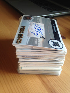
Look at that stack! Far out, man…
 
Most of these were his own cut custom cards. These are really well-done. I was actually thinking about using some kind of custom cuts for my ATB collection, particularly with guys who never appeared on a Brewers card.


And this is about as nice a custom as I could ever dream of being able to someday, after a lot of practice, be able to almost make. They really tie the collection together.


Most of these are of mega-obscure players, many of whom never even had a real MLB card. Some though, like Tyler Houston and Gerardo Parra, are more prominent, but tough to find signed on Brewers cardboard.

The only drawback with these is that most are blank-backed. I might get creative and try making my own custom backsides for these, with stats, etc. This is not a First Amendment thing, man.

Meanwhile, some of them do have printed backsides like this…


He also threw in some custom on-card autos.


Again, featuring players that most people outside of Brewersnation (or inside, for that matter) will remember. But what do you do when you get cut by the Brewers? You turn in your library card? Get a new driver’s license? STOP being a Brewer?


He also included some traditional signed cards, including many sigs I’ve been chasing for a long time.


A number of these were minor league cards. My very favorite of the bunch might be this old-ass Doug Loman TCMA Vancouver Canadians card. I dig his style, man…


I also dig this Neal Cotts, which has a transaction “bubble” on it mentioning that he had been promoted to Visalia. I don’t think I’ve ever seen that on a minor league card before.

All told, he send me 46 (!!!) signed Brewers cards to add to my collection, jumping me to 412 different signed cards in my collection – 48% of the all-time roster. With a batch of TTMs about to go out this coming week, I might actually be able to hit the half-way point before the All Star break.

Having a signed card of one of every two players who ever appeared with the Brewers?

That had not occurred to us, Dude.

Friday, April 20, 2018

2018 brewersNOW is LIVE and In-Hand!


It’s been a heck of a thing to see my fun little idea (or call to revolution, if you took my hyperbole to heart) about creating a custom living set for this year’s Milwaukee Brewers inspire fellow collectors to try the same with their favorite teams. Nick Vossbrink did a very nice SABR blog piece on the idea, which included some of my mock-ups, as well as of those of Battlin’ Bucs, who is doing a set of front-only Pirates UD Documentary-style cards in a beeyootiful 1960 style, and Nick’s own set of 1993-inspired GiantsNOW cards.

Lacking the design skills of … well, anything beyond MS Paint, my idea was to use the Rookie App to build my cards in one of their pre-made templates. I had a lot of fun just playing around in the app, but I was a little worried about the end product. First off, I wasn’t sure if they’d let me do it, what with copyright stuff and all. Second, I wasn’t sure how these cards would look as a finished product, especially in terms of photo quality. The first of these concerns was eliminated earlier this week, when I got a notice that my order had printed and would soon ship. Whew. Good thing I went ahead and secured permissions to use all of those photos, eh? Yeah…

The second issue was solved today, when I got my first pack of 2018 brewersNOW (a title that just kind of happened… not sure how I feel about it) in the afternoon mail.


The cards come in a faux-wax back, which is a nice touch. And when I finally tore this sucker open, I was very happy with what I found.


The photo quality was excellent, as good as I could have hoped for. I might need some help from Nick on the terminology here (maybe I’ll send him one to examine), but they look a lot like junk product from the 80s or early 90s, with the images that certain kind of grainy. Personally, I think they look fantastic. I was worried about pixelization, but there was none of that to be found.


The colors are bright and sharp on this Pat Murphy card, one of my favorites from this first bunch.


And how about this oddity... a "pinch hitter" card. Ji-Man had one PA before being send down this year. So I went with his primary position thus far. 


Here is as nice a close-up as my phone camera would allow. You can see that the stripes in the design have a bit of back-drop to them… not a design element I would have used, but overall, I really dig how these look.


In the true spirit of 1980s Topps, I even ended up with a mis-matched color scheme, with blue and orange repping the blue-n-gold Brewers. I know I’ve complained about this in the past, but I think it works here. Yellow was not even an option on this particular design, and I think it would have come out too light anyway.

The cards have a unique “feel” to them. Not like anything from the 80s that I can recall. The fronts are matte, but still pretty slick. The nearest product I can think of is 1994 O Pee Chee, but even that isn’t really correct.


The design templates have some limitations. Here, I had to go horizontal on the photo to make it fit. I don’t hate this, but I’ll probably try to avoid as I build the set.


And yeah, we’ve got some errors. Here, you can see that I used the tag “2018 Highlight” on the first two cards of the highlight series and “2018 Season Highlight” on the rest. This works OK, considering the first two are Spring Training cards and the rest are regular season. So I can live with that. But shame on me for dropping the T on that card on the top.

Speaking of which…


Who wore it better? I got the first (and probably only) Topps Now card I’ll get this year earlier in the week.


Personally, I think my copy is better, even with the typo.

I decided on making the players and the highlights two different sets. I was having fits trying to figure out the numbering for these, so breaking them into series was the easiest solution. For the Highlight backsides, I went with this 87-inspired look. I have room for about 74 words of text, a quick linescore and a big-ass brand name.


About that type… it’s tiny. Yeah, I’m not crazy about that.


The backs of the player cards are much easier to read. I added a uni number space to the heading and a vital info line just below. These offer room for about 50 words of copy and a single-sentence “fun fact.”

Overall, I’m thrilled with how these turned out. I’m working on the next “series” right now, with about 12 cards designed. I’m eager to get some more of these but, at around $16 per 20 card series, I am aware that this endeavor could get pretty pricey pretty quick. But screw it. If the Brewers keep making highlights, it’ll be worth it.

Thursday, April 5, 2018

Brewneverse Update!

The deadline has now passed for making a guess at the "How Big is my Crewneverse?" contest, which will give out a fine prize package for whoever can guess nearest to the total number of unique Brewers cards in my collection. 

Here are the entrants and their guesses:


Laurens – 2,200
Angels in Order – 4,444
Sportscard Collectors – 4,444
Doug Hoback – 6,500
Mike Matson – 6,700
Gavin – 6,969 (nice)
Bo – 7,676
GCA – 7,955
Trevor P – 8,100
Adam Kaninger – 8,750
EP – 9,009
Nick – 9,219
Rob 792 – 9,482
Jon – 9,700
Fuji – 9,887
Adam Sanders – 10,100
ARPSmith – 11,111
The Lost Collector – 12,224
 

4,444 was a popular guess and I supposed I should think of some kind of rule to deal with a tie. However, since I am sitting at 1,719 having just finished the E's, I'm sorry to say that both Angels in Order and SSC (as well as Laurens) will probably come in a bit short. 

I have yet to make much more progress in the count, which involves sorting, weeding out doubles, ordering by year and brand, and entry into the trading card database. I was planning on using my birthday off-day (today, wheee!) to get through the F's and G's, but I sliced off a tiny, tiny piece of my thumb last evening while chopping food (no fooling... lotsa blood, but I'm fine) and the resulting band aid has made my card-flippin' thumb pretty much worthless. So, I'll need to wait until I can go bare-thumbed to get back at this. Anyway, the longer this contest goes on, the more fun stuff I'll add to the pot. So there's that. 

And how about some more for the pot?


How about these? That's a 1995 TSC Clear-Cut Leaders card of Len Dykstra that was the big hit from my recent Goodwill pack find. And a deck of hologram stickers from a 1991 factory set. Clear! Shiny! It's got something for everyone!

Now, if you'll excuse me, I need to go injure myself in another remarkably stupid way. Perhaps I'll set myself on fire trying to blow out a birthday candle...