My recent post about boxes got me thinking about this post I did many moons ago at my old Summer of 74 blog. Now that I have a bit larger readership, I thought I'd share again, since it is one of my favorites.
When I was doing my recent collection clean-out, it dawned on me that
the oldest part of my collection (meaning the thing I’ve owned the
longest, not the oldest thing overall) was something that I never even
considered to be a part of my collection at all. Indeed, this item might
be the single solitary ‘thing’ of any kind that I have owned longer
than anything else. Are you ready? Can you even handle this excitement?

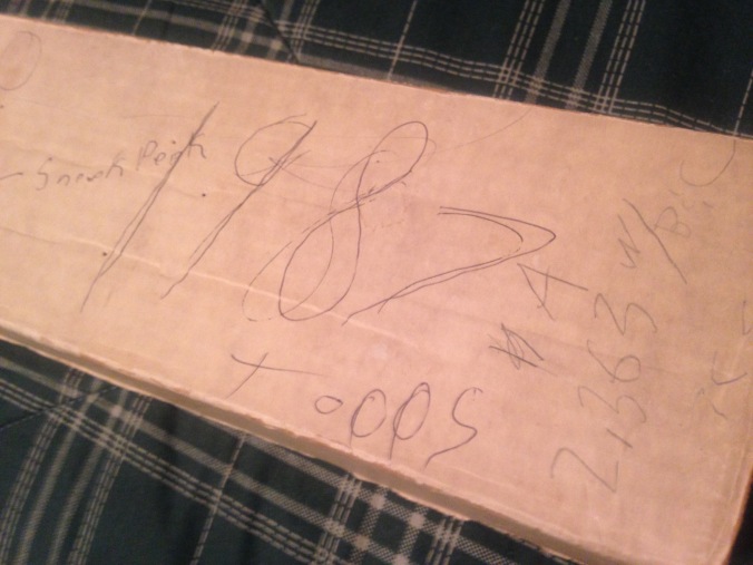
No, it’s not a set of 1987 Topps. It is the box that once held that
set. Back in probably about 1990, my dad took me a card show at a local
bowling alley (oh, those go-go ’90s!). One of the dealers was an old
friend of his, a former co-worker at the Milwaukee Sentinel distribution
building in Manitowoc (my hometown and YES the Making a Murderer Manitowoc). My dad,
being under the impression this hobby of mine could be something like an
investment opportunity, asked the dealer for a set of cards with a good
potential to increase in value and, it being 1990, he recommended the
rookie-loaded ’87 Topps set. If I recall correctly, my old man paid
about $30 for the set – a friend price, mind you – that came housed in
this 800-count box.

Oddly enough, I never bothered to put the set into pages, or ever to
removed from this box. But I looked at it endlessly, filing through the
cards and MARVELING at the Bo Jackson and Mike Greenwell and Will Clark
rookie cards. I even kept a spare George Bamberger card in the box (with
the Brewers checklist on the back), so I could pull up the Brewer cards
without needed to search for them. I loved this set to death,
literally, rounding the corners and denting them all to hell from the
constant handling. I even wrote my name on the end of the box, just in
case I took it out of the house and lost it or it was stolen during a
robbery or a tornado tore the roof off our house and blew the set
through a tree trunk three blocks away. I was prepared for anything.

Yes, I was even prepared to sell it. “50.00” firm, my man, no friend
discounts here. I even decided to charge “5.00” for a “sneek peek” of my
treasured cards. That’s right, folks, just $5.00 to LOOK at my 1987
Topps cards. I am sure I planned to end the sneak peek right before the
Pete Rose manager card came up, just like the old peep shows that cut
off right before the woman’s clothes started coming off. Another $5, of
course, will get your all the way through the All Stars, I promise,
maybe even to the Turn Back the Clocks.
Some time after I got this, an uncle of mine who also collected cards
gave me his 1987 extras (1,571 of them, if my math was correct… I’m
sure my math was not correct), which I put into a couple of other boxes.
That made this the “A” box and the others “B” and “C.” I was now
building an ’87 Topps empire.
And still, I was fully prepared. I would be able to identify this as
the A box from any angle, even it it was partially or mostly obscured.
Even if I didn’t have my glasses. Even if the room was dark as pitch.
Even if it were on the face of the goddamn moon!
The thing of it is, I don’t even remember what happened to the cards
this box once held. I think I might have used them as filler is sending out other things during on my eBay purge periods. I’ve considered throwing the box out multiple times –
that’s actually what I was thinking about doing when I realized that I’d
owned this box for 27 years – or turning it inside out to lessen the
embarrassment of all the stupid stuff I wrote on it. One old girlfriend,
probably the first I’d ever had the courage to let see this box, used
to mock me for it all the time. I’d get some cards in the mail and
she’d go, “Oh! Did you buy them or just get the sneak peek?” But I’m
glad to still have it. It’s a beacon for my collecting goals. A reminder
to keep what I like and forget about the rest.
It was the hour or two on a lazy afternoon that I spent catching up on some podcasts and sleeving up my '91 Topps set that inspired me to do yesterday's post.
The set contains 792 cards, a memory-loaded number for many collectors. 792-card sets fit perfectly into 88 9-pocket pages, leaving the final card in a satisfying spot in the final page of the binder.
But my set didn't have 792 cards! Nine were missing! As I mentioned, I only paid five dollars for the thing. It came in a factory set box and may or may not have been sealed when I bought it (I can't recall).
Anyway, my beautiful 1991 Topps set is short the following cards:
79 - Frank Thomas
243 - Lance Johnson
393 - Carlton Fisk AS
414 - Sammy Sosa
420 - Bobby Thigpen
523 - Rodney McCray
620 - Ozzie Guillen
781 - Darryl Hamilton
785 - Scott Fletcher
Eight White Sox and the late, great Darryl Hamilton. Weird...
Anyway, if anyone has any of these laying around, I'd greatly appreciate a PWE.
I turned nine years old in 1991. I had been marginally collecting baseball cards for the past two years, but I remember my habit really ramping up in '91. And it was a hell of an easy time to be a card fiend. Nearly every grocery store, pharmacy, or sundry shop had a display of cards, ranging from a box or two near the King Size Twix bars at the local UniMart to entire aisles of cards, supplies, and hobby mags at Fleet Farm or ShopKo. And every boy my age seemed to collect cards at least part-time. Our town had a pretty large Hmong population and the even the Hmong kids in my grade school classes - first-generation Americans who grew up, for the most part, in non-English-speaking households - found their way into collecting. It seemed that the hobby, among kids, was less about sports and more about the trend... something like fidget spinners or pogs or whatever else becomes the brief chic thing to do. It was about fitting in and participating in something, but it was also about social class and money (no collector went without a price guide). It was a weird mix of childhood innocence and this unfortunate kind of classroom capitalism that led to the most impressive collections, and therefore most impressive collectors, dictated by the Holy Price Book.
I often look back at the time when I was most active as a young collector, back in the mid-90s, with regret. Both myself and other kids I knew who collected were slaves to the price guide. It's how we balanced our trades and its what got us excited about ripping packs. It was fun, I suppose, but I was clearly missing the point of the whole reason for collecting. But there was a time just before this when I was probably most "woke" as a young collector. It was 1991.
First off, allow to digress for a moment. Since I just used the term "woke" in a place where it probably really should not have been used, I have to revisit a point I made earlier... pretty much every boy I knew collected cards, but I do not recall any girls who were into cards. Granted, I was pretty terrified of girls until the age of... oh, about 21. But there must have been at least a few, and I certainly remember girls who were into baseball or who played baseball in little league. Do any of you remember any girl collectors as kids?
Anyway... 1991. I was a Topps man by virtue of 1989 Topps being the the first cards I ever opened. And in 1989, unless you had the money for Upper Deck, Topps was tops. But into 1990, Topps began to feel kind of old-fashioned. It lacked the white stock used by everyone else, it was a bit late on a lot of rookies, and was just kinda, well, dorky. When I saved up my allowance money for a factory set in the fall of 1990, I had the option of UD, Topps, Fleer, Donruss, or Score (yeah, the local department store sold ALL of them). Not wanting to spend the extra $10 on Upper Deck, I went with Score. It was bright, clean, and a mile more fun that the old grey lady that was Topps. I remember the Topps set being the one I wanted the least of the bunch.
Topps must have realized they were falling behind, too. So for 1991, their 40th baseball set, they drastically overhauled the look of their flagship set. They adapted a sleeker design and made, what I think, is still the greatest single-season improvement in overall appearance in trading card history.
The design itself was far more understated than the garish 1990 set. They used a special Topps logo for the first time ever, marking without doubt that they were "The Real One," masters of business that other companies had just gotten into. A ribbon at the bottom of the card contained a low-profile player name and position, with a pair of boarder lines running around the photo, making an excellent use of team colors. This had the effect of placing much more emphasis on the photo, a tactic that Upper Deck had been using for both of their baseball issues to that point. Another ribbon in the lower right carried a team wordmark, only the fourth time since 1960 (!!) that Topps had used any kind of team logo in their design and the first time any card had carried a team wordmark (Upper Deck used it in their 1992 baseball issue).

Just look at that! What a damn beautiful baseball card. With much encouragement from my bi-monthly issues of Topps Magazine, this set restored my wavering faith in Topps. (yeah, I snapped all these pic from my binder, I'm lazy)
One of the big things that Mag gushed about what the photography of the set. And they were not exaggerating. 1990 Topps, and decades of previous sets, had relied heavily on portrait shots and spring training photos. Those appeared in the '91 set, too, but they are far more interesting and lively.
Here's an action ST shot far more action-packed than anything in '90 Topps.
And here's a headshot that is actually fun and engaging. An alien concept to years previous.
But, of course, it was the action shots that most captured my attention. Many of the most memorable used a horizontal orientation, the first time Topps had used that since 1974.
Here's Walt Weiss flying over Joel Skinner.
And here's Dwight Evans stroking a hit at Fenway.
And here is what might be the greatest single baseball card ever made.
But not all of the great horizontal cards needed such interesting shots. Some took what might have been pedestrian images and allowed them to be framed in such a way that really makes them pop.
Like framing Nolan Ryan's follow-through.
Or using the turned heads of the Wrigley Field fans and the Cubs' catcher to give depth to this shot of Will Clark preparing to leg one out.
Depth! Yes, the '91 Topps set used depth better than any set previous. They had tried in 1971 and 1973, but it didn't really work. In 1991, however, you can get a great 3D effect using the border and, in this case, the Topps logo.
You can get an ump's eye view of Eddie Whitson.
Or to see what Dave Stewart might have looked from the front row.
Topps also embraced the staged photo in '91, something that other companies had only dabbled with. In doing so, they produced some true gems.
This view of Wade Boggs was unimaginable on a Topps card prior to '91.
This card employs an iconic stadium in way that no other card really had before.
And this card used a photograph from a shoot for a Sports Illustrated cover in 1989 - a type of innovation in photo selection that Topps had never dared to try before.
I collected these cards with glee in 1991. I didn't know what they "booked" for and probably didn't care. I just wanted to get all those gorgeous cards I'd seen in the magazine for my own. I picked up a factory set of '91 Topps at a card show a few months ago for $5 and spent the afternoon just thumbing through them. It was a hell of an investment.